Okay, I have to pick on my husband once again.
He is very good at many, many things, and he's not that bad with operating a camera, it is just that he does not have what you'd call "the eye" for it. Usually, I can take one of his images and crop it and make it AWESOME...but when it comes to portraits...neither he nor my younger son, Ross, have a natural talent.
If you read my previous post, How NOT to Take A Headshot, then you saw the images Ross took of his Dad. If you haven't read it, scroll down a few blog posts or just click on the link.
Now, both of these photos needed to have a professional look to them for the purposes of which they were to be used.
I am not a professional photographer. I am more of a hobbyist, but I do read about how to improve my shots. That, and my husband has gifted me some very good lens and flashes for my Nikon Cameras.
I also have a back drop which they set up and lighting which they did NOT set up.
So first, here is the best of the portraits my husband took of Ross who has completed all his requirements for Eagle Scout and needs a portrait.
The only lighting was coming from the ceiling fixture.
This is my unedited version.
And my edited version:
I cropped it in a bit, and darkened the background because there was a slight shadow cast by the flash and I toned down some of the reds in his skin tones and ears.
In my version, he is shaven, has a new haircut, and a new but a bit too large BSA shirt his Dad bought, complete will all his latest patches.
Unfortunately, the color of the shirt does wash out his skin tones.
Also, Ross has a prominent chin like his Dad's and a 5 o"clock shadow immediately after he shaves, so I toned down the high lights and stubble on his chin.
It's all about the eyes and I did bump up the sharpness just a touch.
I turned his right shoulder towards me for two reasons. I feel it showed off his patches and it helped keep the oversize shirt from looking as large.
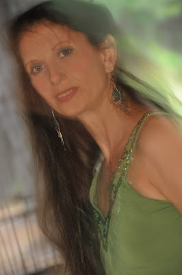
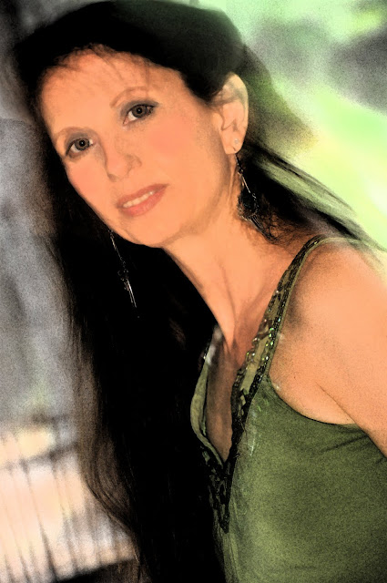
I don't typically follow the rule of thirds on portraits to the exact measurement because I don't like a lot of empty space above the head. In fact, some of my favorite portraits skim off just a bit of the top of the hairline because it makes the hair appear fuller.
For example:
Do you think my hair looks fuller and thicker on top? Or maybe at least you don't notice how flat it actually is.
FYI: My husband did take this photo of me. To be frank, I picked out the location according to the sun and time of day and I told him where to aim. However, there were a LOT of outtakes. Still, you'd think he'd pick on a couple of my tips.
Speaking of tips!
Don't forget my number one tip!
Have FUN!
 |
| I really like this one but he needed a different t-shirt. Darn! |


